
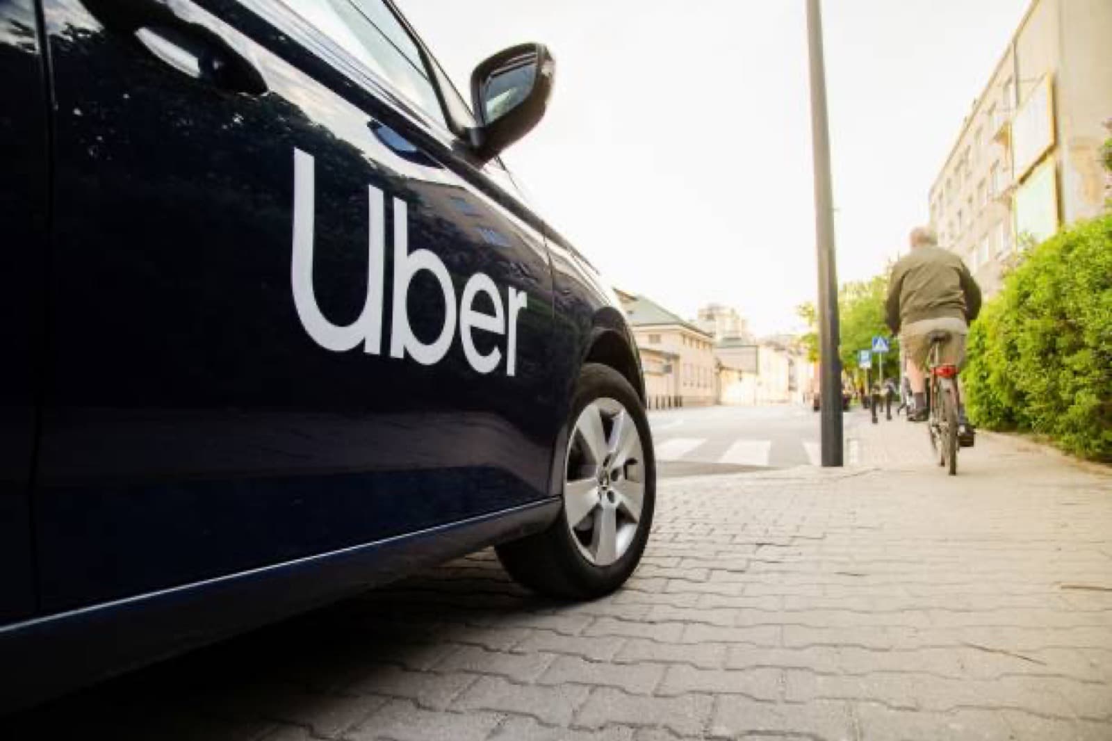
Uber reduced a ride to a pin, a car, and an arrival. The interaction is short because the city is not waiting, and the interface respects that.
Visit UberDesign
A map, your location, and a clear call to go. Status is always visible: who is coming, where they are, and when you will move.
Impact
It retrained cities on what requesting a ride should feel like. The pattern is now the default for on-demand mobility.
How it works
Set a destination, confirm the ride, and follow the car. The entire product is a mobile experience, tuned for one hand and a moving street.
Why it won
Automotive UX here is not the dashboard. It is the few seconds between wanting to be somewhere and being on the way.