
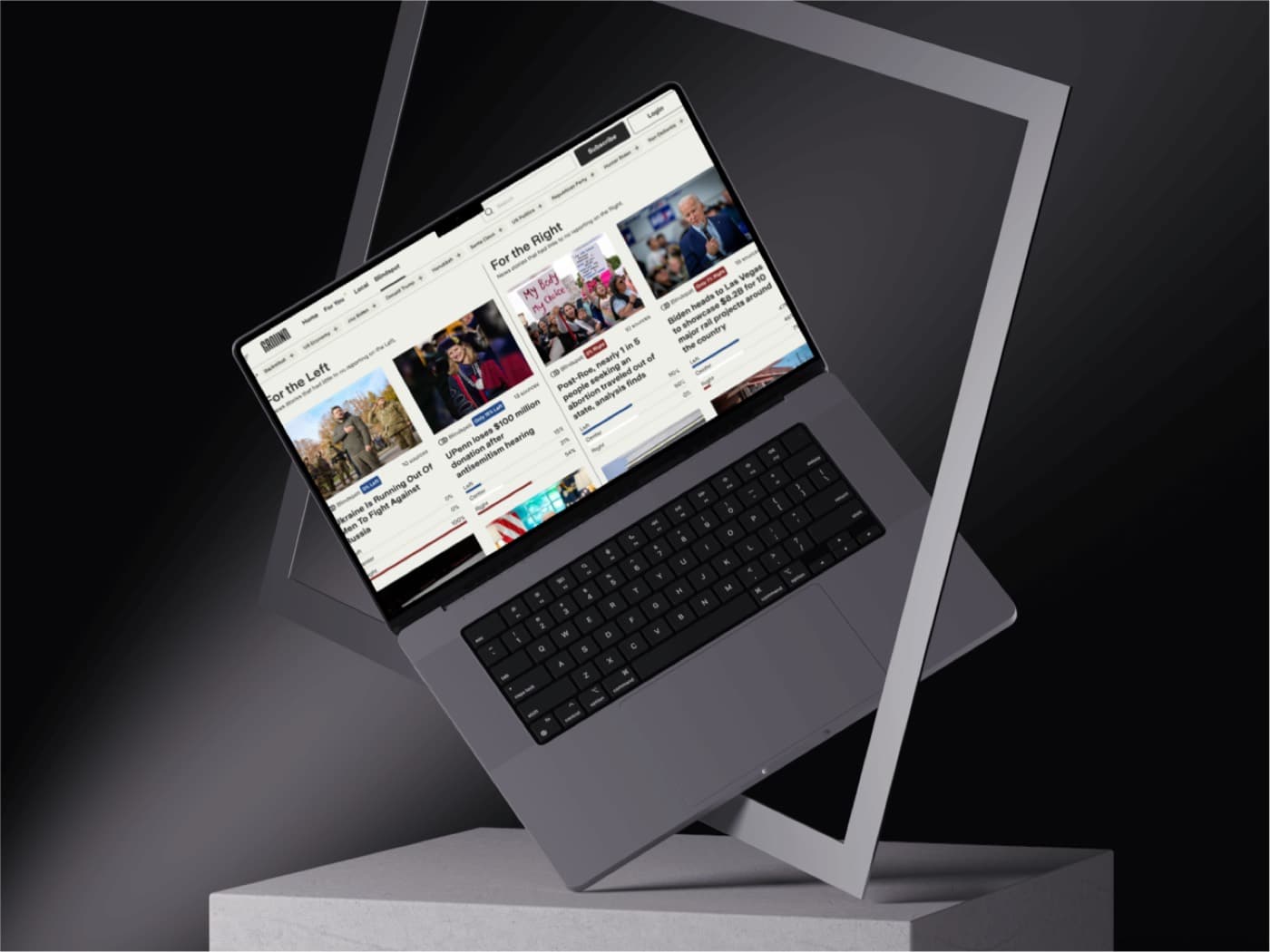
Ground News places coverage of the same story side by side so a reader can see the spread of a narrative instead of inheriting one outlet’s frame.
Visit Ground.NewsDesign
Bias, ownership, and factuality are visual objects, not footnotes. Comparison is the layout, which makes the editorial point without a lecture.
Impact
Readers get a wider field of view on a story. The product pushes media literacy into the interface itself.
How it works
A story collects sources, and the interface groups how those sources cover it. The app keeps that comparison readable on a small screen.
Why it won
News UX usually optimizes for the next click. Ground News optimizes for a reader who wants to see the room.